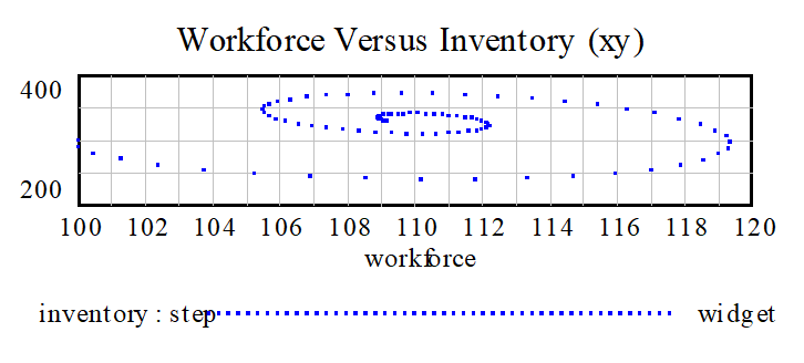
You can use the Graph tool to create XY plots by specifying something other than a time base as the x-axis. The rules for this are exactly the same as those for the normal graph, but you will not necessarily get a sensibly connected line. Typically, an XY plot uses the Dots option to create a scatter plot.
Example

Can be created using the definition:

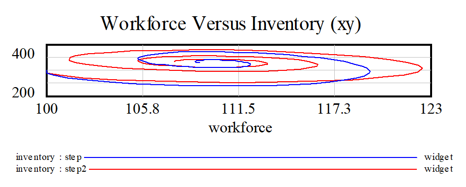
For this particular problem using Dots Only was not completely necessary. In, fact it is fun to look at this graph with completed lines:

Multiple XY plots can be superimposed on one another. You can draw multiple variables relative to a given variable in a dataset, or the value of each x,y pair can be drawn from a different dataset as shown above.