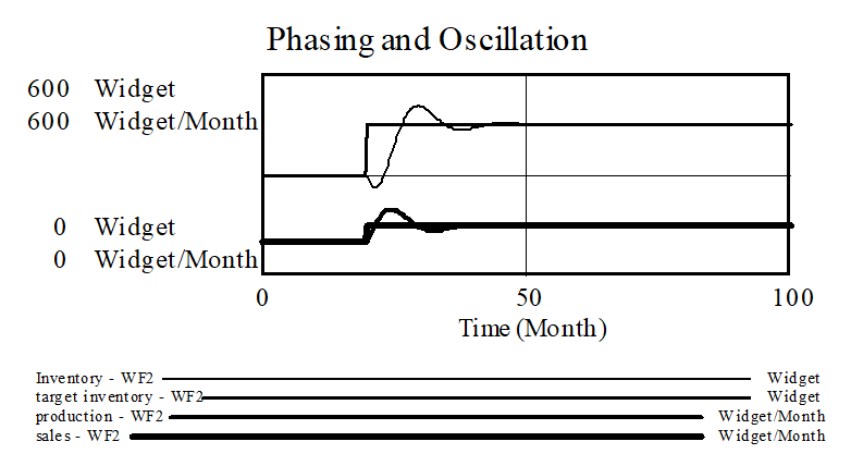
To get some useful insight into this model, and oscillations in general, use the Graphs tab in the Control Panel to create a graph containing Inventory, target inventory, production and sales. Set the scales to zero minimum and 600 maximum values for all variables. You will also need to go the Datasets tab of the Control Panel and put WF2 first.

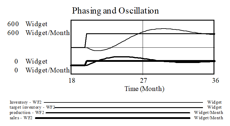
We want to focus in on the timing of changes just after the jump in sales. Hold down the shift key and dragging across the portion of the graph of interest, or go to the Time Axis tab of the Control panel, to set the time focus from approximately 18 months to 36 months. Now the custom graph generates this output:

Initially, when sales step up, inventory begins to fall because sales exceed production. production gradually increases because target production increases with sales and inventory correction increases as inventory falls. However, there is a delay in this process due to the time required to hire new workers. By month 21.3, production is equal to sales, so inventory stops falling and then begins to grow.
While Inventory is increasing, so is production. As long as inventory is below target inventory, there is pressure to increase production, even when production is already above sales. In fact, production needs to get sufficiently above sales so that the ongoing difference balances the pressure from inventory correction before net hire rate will go negative. Note that when Inventory is equal to target inventory, production is still higher than sales because the workforce is excessive, causing an ongoing increase in Inventory. The variability in production is now greater than that in sales; the model is exhibiting the kind of amplification we identified in the reference mode.
In fact, the amplification of variability from sales to production is physically inevitable. The change in production must exceed the change in sales for some time in order to replace inventory lost before production can adjust and to adjust inventory to the new, higher target level.