There are three tools available for the display of sensitivity results: the Sensitivity Graph tool, the Bar Graph tool and, if you are working with Vensim Professional or DSS, the Stats tool. Chapter 15 of the User’s Guide describes how to bring in a toolset with the Sensitivity tool available and Tools in the Reference Guide describe setting up and configuring the Analysis tools.
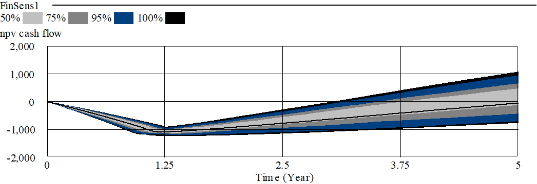
Select npv cash flow as the workbench variable and click on the Sensitivity Graph tool. You should see something like this:

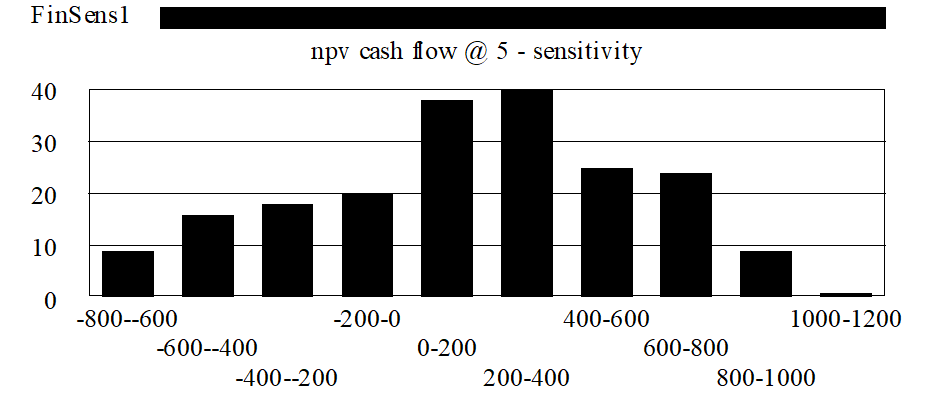
This graph shows the uncertainty in the net present value of cash flow as it changes over time. At any time, half of the simulations have generated a value within the 50% region, three quarters within the 75% region and so on. Two things are worth noting about this graph. First the uncertainty grows over time - a natural result of the cumulative nature of a present value calculation. Secondly, the percentiles are not evenly spaced. We can see this more clearly with the Bar Graph tool . We need to check on the Histogram and Sensitivity checkboxes in the Bar Graph options. Now click on the Bar Graph tool and you will get the output:

Even though we have used a uniform (flat) distribution of uncertainty inputs, this graph indicates that the npv cash flow is distributed with something of a bell shaped curve. This is because we are combining together in this model a number of different independent sources of error. A well known result from statistics is that doing this tends to lead to variables that are normally distributed.
These results show how you can use sensitivity analysis to understand the implications of uncertainty in input on the likely results. The results for the model here show that modest uncertainty of the assumptions results in modest uncertainty around the value of the investment. An investment needs, of course, to be judged against alternative investments. The histogram shown above gives substantially more information than an expected present value in making that judgment.