Just as you looked at the causes of Inventory by using the Causes Tree Diagram Analysis tool you can also look at graphs of behavior of the variables that cause Inventory to change.
| Ø | Click on the Reset All button |
This resets all model constant to their original value. You will see only a single graph line on each variable.
| Ø | Click on Inventory to select it into the workbench. |
| Ø | Click on the Causes Strip Analysis tool |
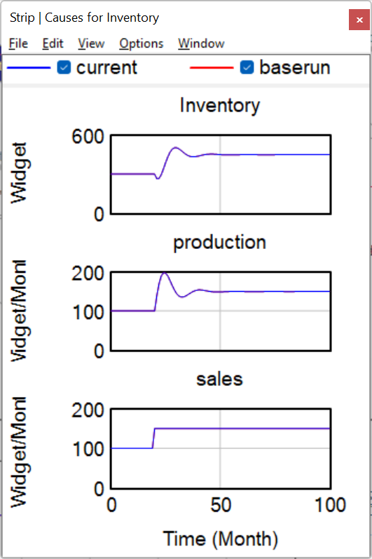
A strip graph is generated that shows the Workbench Variable (Inventory) at the top, and all the variables that directly cause Inventory to change below it (production and sales). The two runs are currently the same, so the graph lines lie on top of one another. You should be able to see two colors in each graph line, the Causes Strip tool uses both color and line thickness to distinguish runs.
Notice something very interesting in this graph. Inventory has oscillating behavior which then is damped out and becomes stable. Inventory is being changed by both production and sales but only production is oscillating. Sales does not have the oscillating pattern of behavior contained in Inventory and production. Therefore we will look into production and not sales to understand the source of this oscillation.
Causal Tracing is a quick and powerful tool that helps us determine what portions of a model are causing which types of behavior. The Causes and Uses Tree Diagrams and the Table tool can all be used for Causal Tracing but the most commonly used tool is the Causes Strip tool and we will use that to investigate the sources of oscillation in this model.
Lets find out which feedback loops in the model are causing the oscillating behavior.
| Ø | Click on production appearing in the Causes Strip to select it as the Workbench Variable, then click on the Causes Strip tool. |
| Ø | Click on Workforce in the Causes Strip that has just been displayed, then click on the Causes Strip tool. |
| Ø | Click on net hire rate then click on the Causes Strip tool. |
The three strip graphs are displayed below. Note how the oscillation is traveling through all these variables.
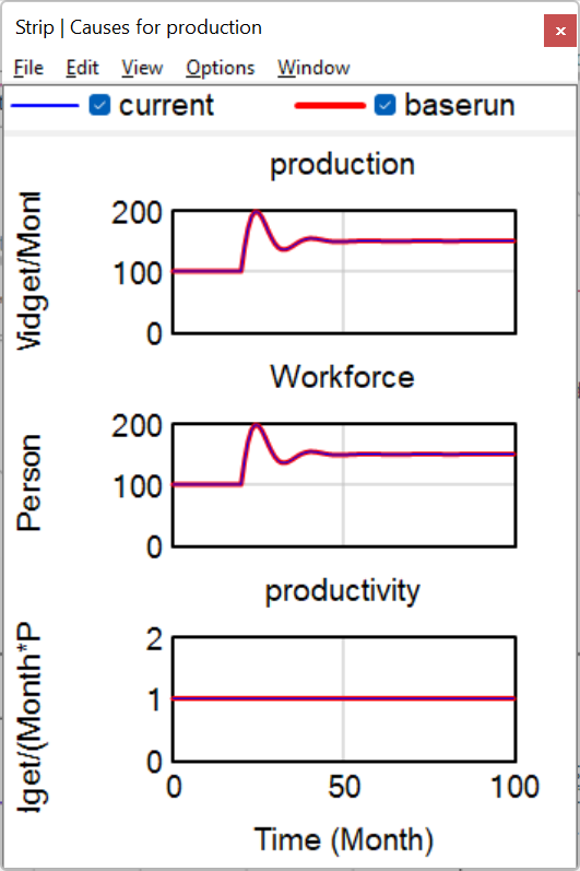
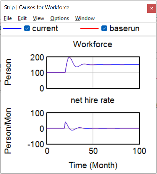
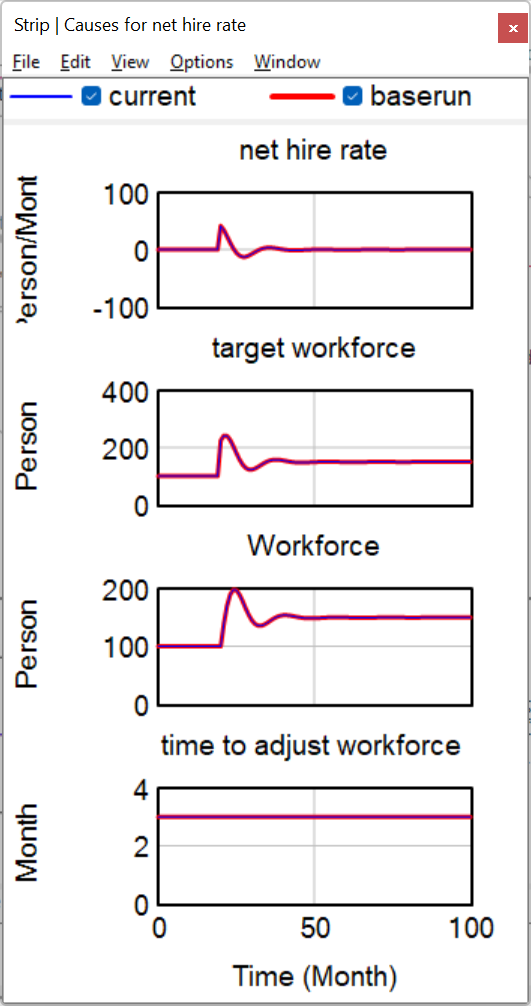
| Ø | Click on target workforce then click on the Causes Strip tool. |
| Ø | Click on target production then click on the Causes Strip tool. |
| Ø | Click on inventory correction then click on the Causes Strip tool. |
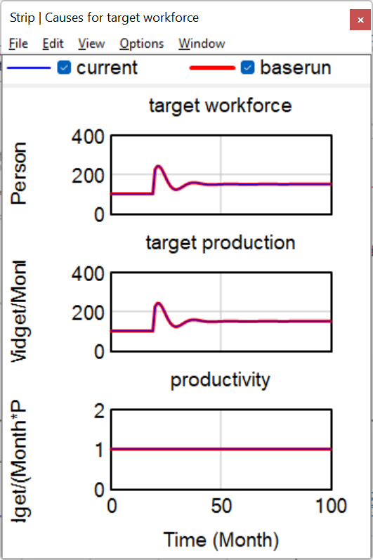
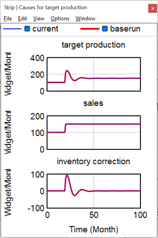
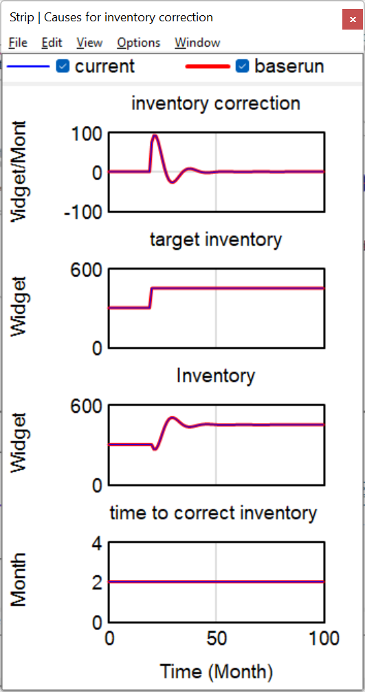
The last two graphs show similar behavior. The Causes Strip for target production shows that the oscillation is coming from inventory correction, not from sales. In the inventory correction graph, we see that Inventory is causing the oscillation, not target inventory.
We know that the oscillations follow a path back to Inventory and do not go through the variable sales. Let's look back at the sketch to get a feel for what is happening.
With your eyes, trace the feedback loop that the oscillations have followed, from Inventory to production to Workforce to net hire rate to target workforce to target production to inventory correction and back to Inventory.
Look at the variable target production. Note how the oscillations travel through the feedback loop to Inventory, not through sales. The variable sales is a Constant with a STEP function. sales causes other variables to change, but nothing causes it to change. sales is not part of any feedback loop. The variable sales imparts the sudden change to the Level Inventory (through a step increase in sales) . The system structure (the negative feedback loop) then tries to correct Inventory and sets up the oscillation at some particular frequency. This is very much like a rocking chair that will rock back and forth in response to a push in one direction.
| Ø | Select the menu item Windows>Close All Output. |