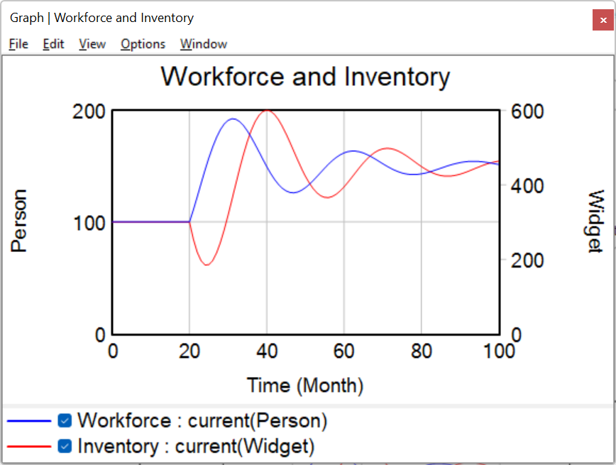
Sometimes you will want to see all of the important variables together in one graph. Graphs generated using the Analysis tools display behavior for the Workbench Variable. Using Custom Graphs, you can display the desired variables, dataset runs, style and formatting in one graph. Custom Graphs are created from the Graph Control located in the Control Panel.
| Ø | Click on the Control Panel button |
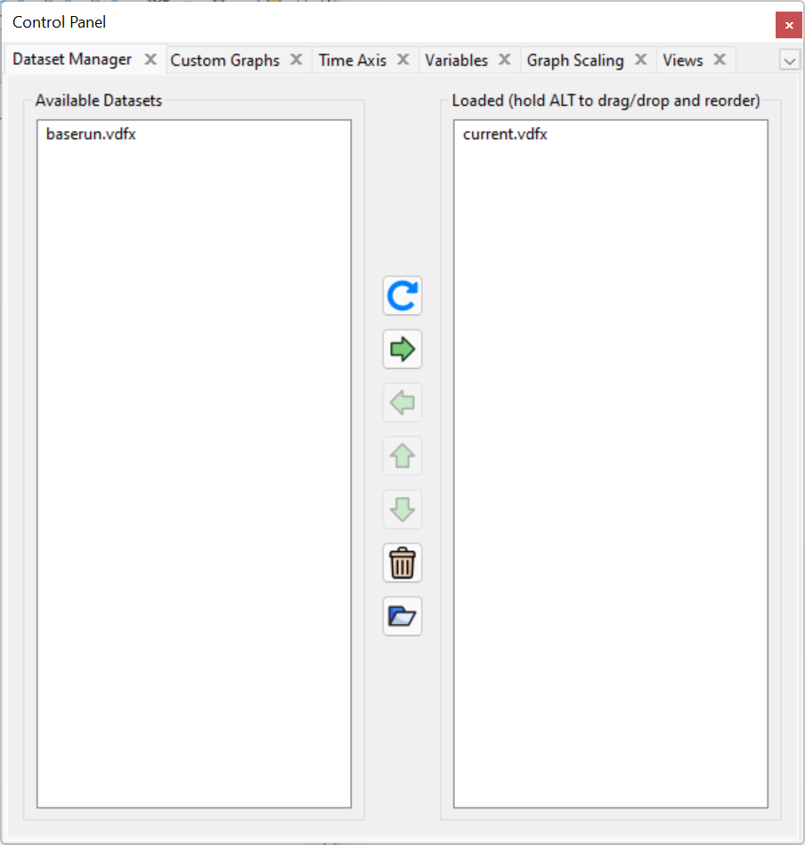
| Ø | Unload baserun by double clicking on the run name baserun in the Loaded runs box. |
| Ø | Click on the tab Graphs in the Control Panel. |
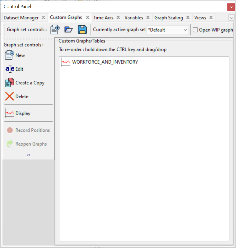
| Ø | Click the button New…. The Custom Graph Editor opens with the cursor positioned at the graph Title editing box. |
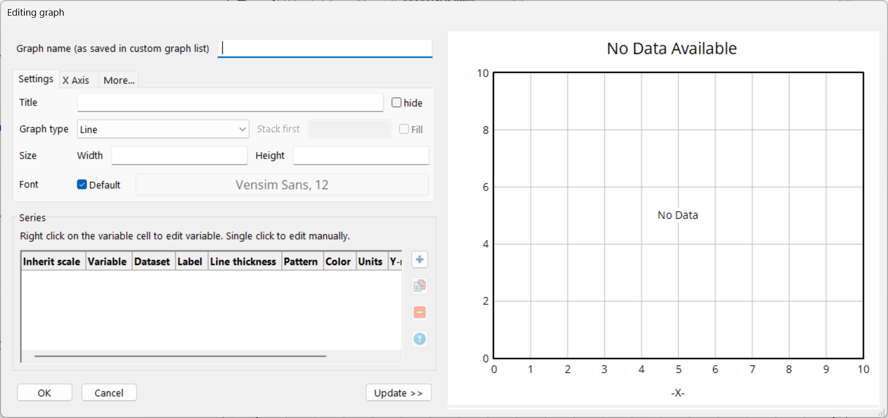
| Ø | Type the name Workforce and Inventory into the Title editing box. |
| Ø | Using the mouse, move to the bottom area, and press the "+" button. Variable boxes on the left side of the graph editor and click on the top button labeled Sel. A variable selection dialog box appears, move the scrollbar down the list and double click on Workforce. |
| Ø | Using the mouse, click on the second button down labeled Sel. A variable selection dialog box appears, move the scrollbar down the list and double click on Inventory (or single click and click OK to close the variable selection dialog). |
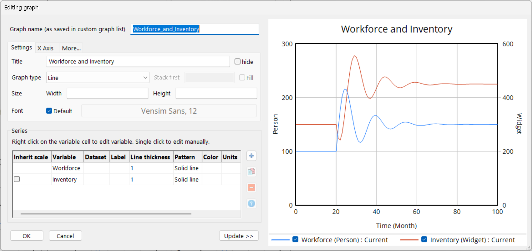
| Ø Click the OK button to close the Custom Graph Editor. |
| Ø | Click the button Display in the Graph Control to show the Custom Graph. |
